How to Color Botanical Illustrations Calmly
A page of leaves and petals does not need a perfect plan. Sometimes the most restful place to begin is with one small leaf, one familiar green, and a few unhurried minutes. Learning how to color botanical illustrations can be less about getting every shade right and more about noticing what feels peaceful in your hands.
Botanical pages are especially welcoming because nature already gives you permission to vary. A rose can lean peach, blush, or deep berry. A leaf can hold olive, sage, forest green, and a touch of gold all at once. You do not need to recreate a field guide. You only need to make choices that feel pleasing on the page.
Begin with a small, comfortable setup
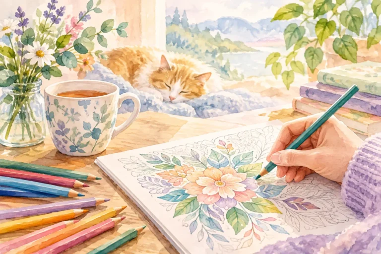
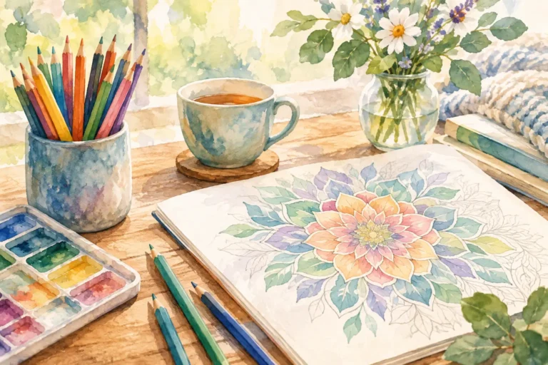
Choose a place where you can settle in without needing to rush. Good light helps, especially daylight near a window, but a warm desk lamp works well for an evening coloring break. Keep your chosen colors nearby and leave the rest of your supplies tucked away. Too many options can turn a quiet activity into a decision-heavy one.
Colored pencils are a gentle place to start. They allow you to build color slowly, correct course easily, and keep fine botanical details visible. Gel pens can add a small bright accent after coloring, while markers create stronger, smoother areas of color. If you use markers in a coloring book, test them on a back page or spare sheet first. Some papers allow ink to show through, and markers can make a delicate design feel more bold than you intended.
You do not need a large collection. A few greens, two or three flower colors, a warm brown, and a neutral shade can take you surprisingly far. The aim is comfort, not a crowded pencil case.
How to color botanical illustrations with simple layers
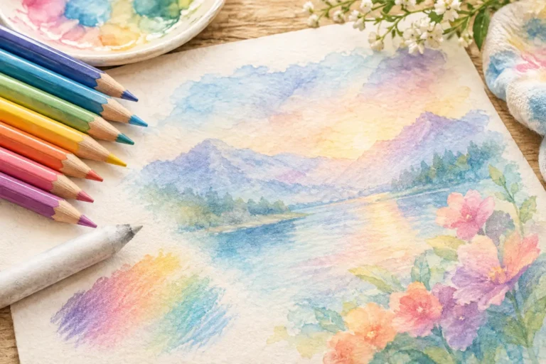
The calmest results often come from working lightly at first. Rather than pressing hard to fill a petal in one pass, lay down a soft base color with small, even strokes. Let a little of the paper show through. This first layer is simply a beginning, not a commitment.
Add a second shade where the plant might naturally turn away from the light: near the center of a flower, at the base of a leaf, beneath overlapping petals, or along a stem. Keep the pressure light as you move outward so the deeper color gradually fades into the first.
Then return with your original color to soften the meeting point. This back-and-forth motion creates a blended look without requiring specialized tools. It is also a pleasantly repetitive process, one that can help slow the mind after a full day.
For a leaf, try starting with a light sage or yellow-green. Deepen one side with olive or moss, then trace the central vein with a slightly darker green. You can leave the other side lighter to suggest a simple source of light. The result does not need to be realistic. It only needs enough contrast to let the shape breathe.
With petals, use the center as your anchor. A pale pink petal might become richer with rose near its base, while a yellow bloom may gain warmth from a little orange close to the middle. Color from the base toward the edge using strokes that follow the direction of the petal. Even a simple shift in direction makes flowers feel more natural.
Let nature guide your palette, not limit it
When you want a calming page, choosing your colors before you begin can make the whole experience feel easier. Look at the illustration and select a small family of shades that belong together. Three to five main colors is often enough for a balanced botanical page.
For a soft garden feeling, pair sage green with dusty pink, pale lavender, butter yellow, and warm brown. For something brighter, try leafy green, coral, sunny yellow, and sky blue. For an evening mood, choose deep teal, plum, muted mauve, and a warm cream background.
Real plants are useful inspiration, but they are not rules. Blue leaves or purple stems can be lovely if that is what suits your mood. Botanical coloring is more relaxing when you stop asking whether a color is technically correct and begin asking whether it feels good beside the colors already on the page.
If you feel unsure, repeat colors. Use the same two greens throughout the leaves, the same warm tone in several flower centers, and one accent color in a few small details. Repetition brings quiet unity to a page and reduces the pressure to invent a new answer for every section.
Create depth without chasing perfection
A little contrast goes a long way in botanical illustrations. You do not need to shade every inch. In fact, leaving some areas light can make your deeper colors feel more intentional.
Think in simple pairs: light and dark, warm and cool, soft and vivid. A pale green leaf looks more dimensional beside a darker stem. A peach flower becomes more noticeable when its center is golden brown. A cluster of purple blooms can feel balanced with muted green leaves around them.
Outlining every shape with dark pencil may seem like an easy way to finish a page, but it can make a soft design feel heavy. Instead, reserve deeper colors for selected edges, folds, and overlaps. Let some petals remain open and light. This gives the page a gentler, less crowded appearance.
If you color outside a line, you do not have to fix it immediately. Pause and see whether the mark truly bothers you. Small variations often disappear once the page fills in. If you do want to soften a pencil mark, use a clean eraser carefully or layer a nearby color over it. The page is allowed to look handmade. That is part of its warmth.
Work in sections that feel manageable
A detailed botanical page can look like a lot when you first open it. Instead of scanning the whole design, choose one small area: a single flower, a group of leaves, or one corner of the page. Finish that section before deciding what comes next.
This approach helps you enjoy the process rather than treating the page as a task to complete. Ten quiet minutes with one bloom can be enough. You can return tomorrow for the stems, then the background another day. There is no prize for finishing quickly.
Some colorists like to complete all leaves first, then move on to flowers. This creates a consistent palette and can feel orderly. Others prefer to finish one flower and its surrounding leaves at a time, which offers small moments of completion along the way. Neither method is better. Choose the one that makes it easiest to stay present.
Add a background only when the page asks for one
A background can bring a botanical illustration together, but it is optional. White space has its own calm beauty. It lets leaves and flowers stand out and keeps detailed pages from feeling overly busy.
If the design feels unfinished without something behind it, begin very lightly. A pale blue-gray can suggest open air. A soft cream or light tan can give the page a vintage garden feel. You might also shade only around the outer edges, leaving the center lighter for a subtle glow.
Backgrounds work best when they stay quieter than the plants. If your flowers are colorful, use a muted background. If your flowers are pale, a slightly deeper wash of color around them can help them stand forward. With colored pencils, use broad, gentle strokes and build slowly to avoid visible patches.
Give yourself permission to stop
Knowing when to stop is one of the loveliest parts of coloring. A page does not need every detail filled, every white space covered, or every leaf shaded three times. Sometimes the best choice is to leave a few tiny areas open and let the design stay light.
Set your pencils down when the page feels balanced to you, not when you think it should look like someone else’s. Notice the colors you reached for, the section you enjoyed most, and the small sense of focus you made room for. The next botanical page will be waiting whenever you want another quiet creative pause.