A Gentle Botanical Coloring Guide for Calm
A page of leaves, petals, and curling stems can offer a small place to rest your attention. This botanical coloring guide is not about getting every shade right. It is about choosing a few colors, settling into the page, and letting a simple creative rhythm bring a little more quiet to your day.
Botanical designs are especially inviting because nature already gives us permission to vary the rules. A fern can be deep green, silvery blue, or soft gray. A flower can follow its real-life colors or become whatever shade feels good to use. There is no need to make a finished page look like a garden photograph. Let it feel like your own calm corner.
Start With the Mood, Not the Rules
Before selecting a pencil or marker, pause for a moment and notice what kind of break you need. Some days call for soft, low-contrast colors that feel peaceful and unhurried. Other days may need brighter petals, warm sunshine yellows, or fresh greens that make the page feel lively.
Choosing a mood first keeps coloring from becoming another decision-heavy task. You do not need a large plan. A simple thought is enough: quiet forest, early spring, late-summer garden, misty morning, or a favorite bouquet on the table.
If you want a gentle place to begin, try one of these color directions:
- Soft and restful: sage green, dusty rose, pale lavender, warm gray, and cream.
- Fresh and natural: leaf green, sky blue, butter yellow, coral, and light brown.
- Warm and cozy: terracotta, olive, mustard, burgundy, and deep teal.
- Light and airy: peach, pale blue, mint, lilac, and soft yellow.
You do not have to use every color in a group. Often, three or four shades are enough to make a botanical page feel complete. A smaller palette can also make the process feel more peaceful, especially when your mind is already full.
Choose Colors the Easy Way
A botanical coloring page may have dozens of tiny details, but your color choices can stay simple. Pick one main leaf color, one or two flower colors, and a neutral shade for stems, pots, backgrounds, or small accents. This creates a gentle sense of harmony without requiring careful planning.
For leaves, begin with a familiar green if that feels comfortable. Then add variety only where you want it. Lighter green can make a leaf feel newly grown. A deeper green can add a little weight around the edges or near the center vein. Olive, blue-green, and muted yellow-green are also lovely choices when you want a less traditional look.
Flowers offer more room to play. You might color all blooms in one family, such as pinks and peaches, or let each flower have its own personality. Repeating one shade in several places helps the page feel connected. For example, a small touch of lavender in three separate flowers can quietly bring the whole design together.
Neutrals deserve a place in botanical coloring, too. Warm gray, tan, cream, and soft brown can calm a page that has many bright elements. Use them for background details, seed pods, branches, pots, baskets, or open spaces that need a little softness without demanding attention.
Let Nature Be a Suggestion
Looking to nature can be helpful when you feel stuck, but it does not need to limit you. Real plants offer beautiful color clues: the blue-green of eucalyptus, the pale pink of peonies, the reddish edges of autumn leaves. Still, a coloring page is allowed to be imaginative.
Try a midnight-blue leaf with pale gold veins. Color a cluster of daisies in shades of peach and pink. Give a simple houseplant a terracotta pot and unexpected purple leaves. These choices can make the page feel more personal, and they remove the pressure to copy what you think something should look like.
When you do want a natural-looking page, stay close to a few familiar relationships. Greens pair easily with warm flower colors such as pink, yellow, orange, and red. Cool flowers in blue, violet, or lavender often look lovely beside gray-green leaves. Brown stems and soft beige backgrounds can ground almost any palette.
Work in Small, Comfortable Sections
You do not need to finish an entire page in one sitting for it to count as creative time. In fact, botanical pages are well suited to short pauses. Color a few leaves while your tea steeps. Fill in one flower cluster after dinner. Return to the page for ten quiet minutes before bed.
Starting with one small section can make the first mark feel easier. Choose a single bloom, a corner of foliage, or a row of leaves. Once that area is colored, you may feel ready to continue. If not, you have still made something lovely and given your attention a softer place to land.
Many people enjoy coloring the larger shapes first, then returning to stems, veins, and smaller accents later. Others prefer to begin with tiny details because the repetition feels settling. Both approaches work. The best order is the one that helps you stay relaxed.
Add Depth Only If You Want It
Flat color can be beautiful. A page does not need shading, blending, or complicated techniques to feel finished. If solid color helps you slow the mind, let that be enough.
When you feel curious about adding a little dimension, keep it simple. Use a slightly darker version of the same color along one edge of a leaf or petal. Leave a small area lighter near the center. You can also press a bit more firmly in one spot and soften your pressure as you move outward.
For colored pencils, light layers usually feel easier than pressing hard right away. Build color gradually and let some of the paper show through if you like the softer effect. With markers, test a shade in an unobtrusive corner or on a separate piece of paper first, especially if the design has thin lines or detailed spaces.
There is no need to correct every uneven area. Natural things are varied. A slightly darker petal, a leaf that changes shade halfway through, or a visible pencil stroke can make a page feel warm and human.
Keep Your Materials Simple and Inviting
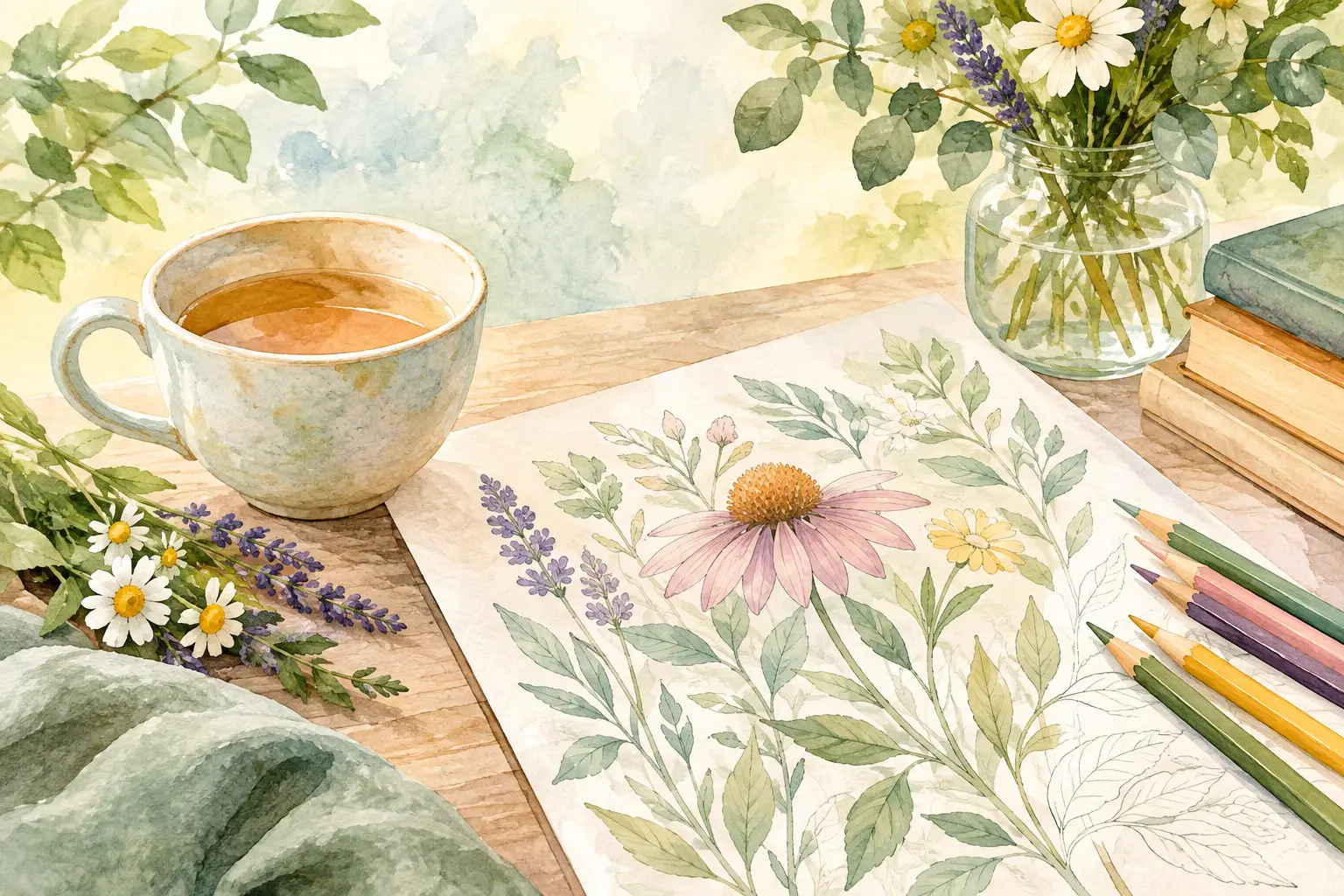
The most useful coloring supplies are the ones you will actually reach for. A small set of colored pencils, markers, or gel pens can be plenty. You do not need a full artist’s collection to enjoy a botanical page.
Consider keeping a few favorite colors together in a small tray, pouch, or cup. When your materials are easy to see, beginning takes less effort. A clear surface, a comfortable chair, and good light can make the experience feel more welcoming, too.
If you use markers, place a sheet of scrap paper behind the page to protect the next design. If pencils are your preference, a sharpener nearby can save you from breaking the quiet flow just when you are settling in. These small preparations are not about perfection. They simply make the creative pause easier to return to.
Make Space for Your Own Style
Some botanical pages will be full of color. Others may use only green, brown, and one favorite flower shade. You may leave backgrounds white because the open space feels calm, or fill them with a pale wash of color because it makes the page feel finished. Both choices are welcome.
Your style may change from page to page, depending on your energy and the time you have. A busy afternoon might call for a few simple strokes. A slow weekend morning may invite more detail. Let the page meet you where you are rather than asking you to perform.
At AmBizi, we believe a coloring book can be a gentle companion for these small moments of quiet enjoyment. The value is not in creating a perfect result. It is in making room for color, focus, and a break that feels pleasantly yours.
The next time you open a page of leaves and flowers, choose the color that feels easiest to reach for. Begin with one petal, one stem, or one small patch of green. A calm creative pause does not need much more than that.