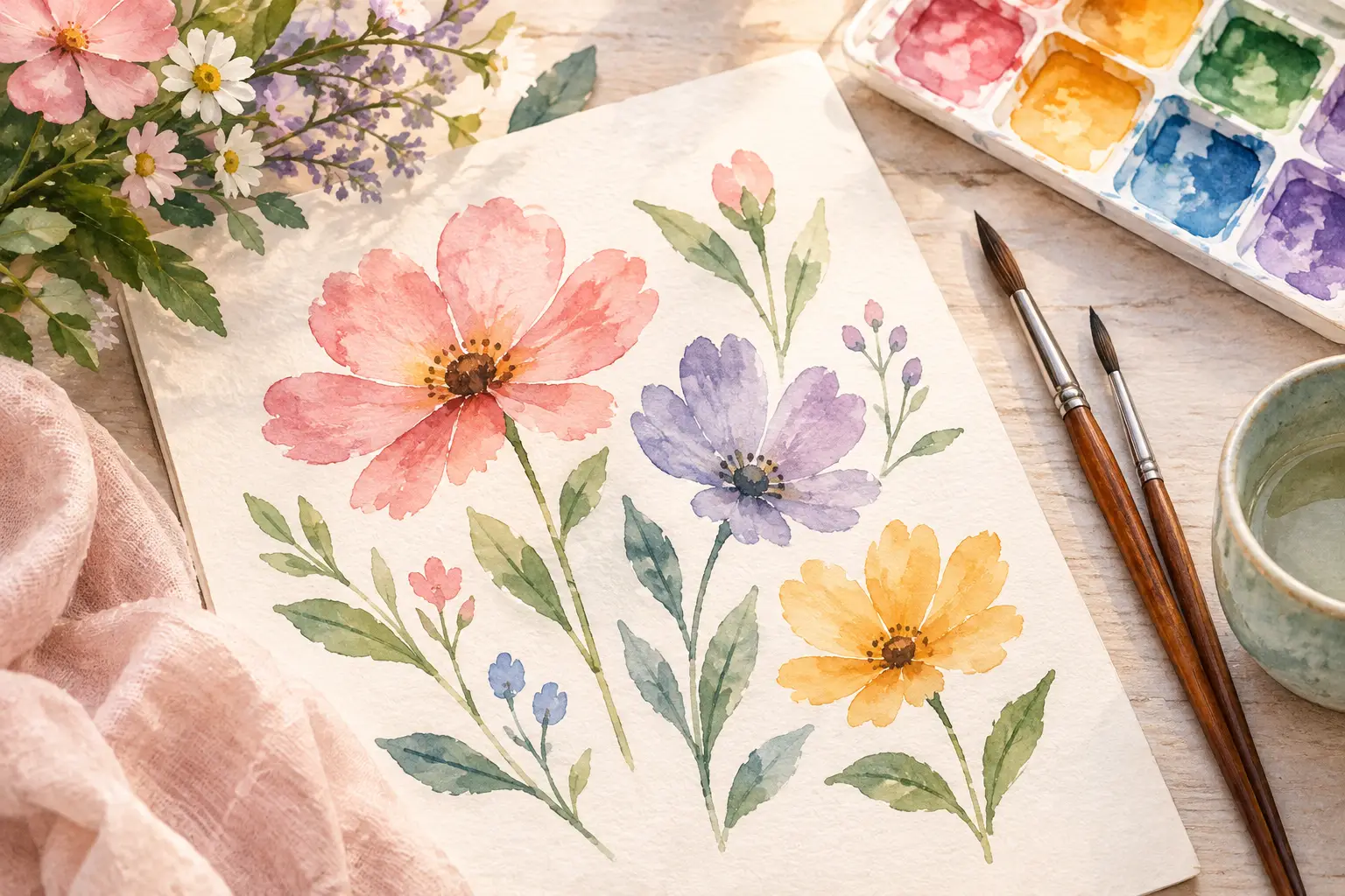
How to Color Simple Florals for a Calmer Break
A simple flower page can be the quietest place in your day. When your thoughts feel scattered, learning how to color simple florals gives your hands one small, pleasant thing to focus on: a petal, a leaf, a soft patch of color. There is no need to make every bloom realistic or perfectly blended. The point is to slow the mind and enjoy the page in front of you.
Simple floral designs are especially welcoming because they leave room to breathe. Large petals, open leaves, and uncomplicated shapes let you choose as much detail as you want. You can finish a small section in ten minutes, or settle in for a longer, screen-light creative pause.
Begin With a Palette That Feels Good
Before coloring the first petal, choose a small group of colors. Limiting your palette can make the page feel more cohesive, and it also removes the pressure of making a new decision with every flower. Three to five colors are often enough for a simple floral design.
You might choose soft pink, coral, and warm yellow for a cheerful page, then add two greens for the leaves. For a quieter mood, try lavender, dusty blue, pale peach, and sage. If you prefer richer color, deep red flowers with olive leaves and a warm brown center can feel grounded and cozy.
There is no universal “right” floral palette. A sunflower can be purple. Leaves can be blue-green. A bouquet can hold colors that would never appear together in a garden. If a combination feels pleasant to you, it belongs on the page.
It helps to test your colors in a small blank area, on a scrap of paper, or along the edge of the page if there is room. This quick moment can prevent a color from feeling too dark or too bright once it covers a larger area. More importantly, it gives you permission to change your mind before you begin.
How to Color Simple Florals One Layer at a Time
Start lightly. Whether you use colored pencils, gel pens, markers, or crayons, a gentle first layer gives you room to adjust. Color each petal with soft, even strokes, leaving a little more pressure near the outer edge if you would like the center to stay lighter.
For many simple flowers, it is easiest to begin with the petals, then move to the center, leaves, and stems. Working in small groups keeps the page from feeling like a project you have to finish all at once. Color one bloom completely, pause, and decide what feels good next.
If you are using colored pencils, let your strokes follow the shape of the petal. Draw from the base of the petal toward the tip, or from the tip inward, rather than scribbling across it. The color will look smoother even without advanced blending. For rounded leaves, follow their curve. This small shift adds a natural sense of movement without requiring extra effort.
Markers create a more solid look, so work one section at a time and keep the color moving while the ink is fresh. If your markers tend to bleed, place a sheet of scrap paper behind the page. Gel pens can add bright, satisfying detail, but they are often best saved for small accents such as flower centers, veins, dots, or a few special petals.
Add Gentle Depth, Not Perfection
A little shading can make a simple floral page feel more dimensional, but it is optional. Think of shading as a soft suggestion, not a rule you have to get right.
Choose a slightly darker version of your petal color. Add it near the base of each petal, where petals overlap, or along one outer edge. Leave the rest of the petal in the lighter shade. The contrast does not need to be dramatic. Even a thin layer of darker color can make the flower feel fuller.
For leaves, place deeper green near the stem or along one side of the leaf. You can add a single vein down the middle, then stop. A few lines are enough to suggest a leaf’s shape. Trying to shade every tiny area can turn a calming activity into a fussy one, especially if you only have a short break.
Flower centers are an easy place to add texture. Use dots, tiny circles, short strokes, or a darker ring around the middle. Brown, gold, rust, and deep purple all work beautifully, depending on the mood of your palette. A simple center often makes the whole bloom feel finished.
Let Repetition Make the Page Peaceful
Floral coloring has a natural rhythm: petal, petal, center, leaf. Repeating these small shapes can be part of what makes the activity so restful. Rather than looking at the entire page, choose one repeatable action and stay with it for a while. Color all the flower centers first, for example, then return to the petals.
This approach can also help when a detailed page feels overwhelming. You do not have to decide how to color every element before you start. Give yourself one simple instruction: “I am coloring the leaves for the next five minutes.” When that time is over, you can continue or put the book away without feeling like you have left something unfinished.
A page does not need to be completed in one sitting to be satisfying. A partly colored bouquet can wait for you tomorrow. Returning to the same colors and familiar shapes can become a gentle ritual, especially at the end of a busy day.
Use White Space as Part of the Design
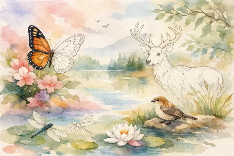
One common mistake is feeling that every inch of the page must be colored. White space can make flowers stand out and keep a design feeling light. Leaving a few petals pale, keeping the background blank, or coloring only selected leaves can create a clean, airy result.
If you do want a background, keep it simple. A pale blue halo around a bouquet can suggest sky without filling the whole page. A soft gray or warm beige around the edges can make the flowers feel framed. You might also add a few scattered dots, tiny hearts, or loose lines in one accent color.
Backgrounds are where it depends most on your materials. Colored pencils offer a soft, gradual look but may take longer over a large area. Markers fill space quickly, though they can compete with delicate flowers if the color is too strong. When in doubt, leave the background for last. Once the blooms are finished, you will know whether the page needs anything more.
When a Color Choice Does Not Work
Sometimes a color looks different on paper than it did in your mind. That is normal. Instead of starting over, see whether the unexpected shade can become part of the design.
If a petal is darker than you wanted, balance it with a few more dark petals elsewhere. If one flower feels too bright, use that color again in a small detail such as a center or a border accent. Repeating a color helps it feel intentional.
With colored pencils, a lighter pencil can soften a darker area when layered on top. With markers, you may not be able to lighten the color, but you can build around it with neighboring shades. A page becomes more interesting when it has small variations. Perfect matching is not required for a peaceful result.
Make the Experience Your Own
The best way to color simple florals is the way that invites you back. Some days, that may mean using only two colors and finishing one small bloom. Other days, you may want to layer petals, add tiny details, and fill the page slowly. Both choices count.
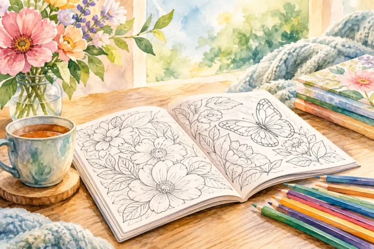
Keep your favorite tools together where you can reach them easily. A coloring book, a small pencil set, and a comfortable spot can offer a welcome alternative to another scroll through a screen. AmBizi floral pages are made for this kind of quiet enjoyment: simple enough to begin without hesitation, open enough to make your own.
Pick one flower, choose one color you enjoy, and make the first gentle mark. The rest of the page can wait until you are ready.