How to Select Soothing Colors for Coloring
A page of flowers, leaves, or gentle woodland animals can feel very different depending on the colors you choose. Learning how to select soothing colors is less about following strict art rules and more about noticing what helps your mind settle. The right palette can turn a few quiet minutes with colored pencils into a softer, more focused creative pause.
How to Select Soothing Colors That Feel Right
Soothing colors are usually gentle rather than demanding. They do not compete for attention or make every detail feel urgent. Think of the shades you might notice on a peaceful walk: muted green leaves, a pale blue sky, warm sand, lavender petals, or the soft brown of tree bark.
There is no single palette that calms everyone. A person who finds dusty blue restful may prefer warm peach or soft olive on another day. Start with your own response. If a color feels comfortable to look at for several minutes, it is a good candidate for your page.
The simplest approach is to choose a small group of colors before you begin. Four to six shades are often enough for a floral or nature-inspired design. Limiting your choices removes the pressure of deciding what comes next, so you can stay with the pleasant rhythm of coloring.
Begin With Low-Intensity Shades
Bright colors have a place, especially when you want a cheerful lift. But for a calmer experience, look first for colors with less intensity. These are often called muted, dusty, soft, or earthy shades.
Instead of a sharp primary red, try rose, terracotta, or a faded berry tone. Rather than a vivid grass green, consider sage, moss, olive, or eucalyptus. Swap electric blue for misty blue, denim, slate, or blue-gray.
These colors tend to sit beside one another more quietly on the page. They create a sense of harmony without asking every flower, feather, or leaf to stand out at once. If your pencil set has many options, choose the shades that look slightly softened with gray, brown, or white.
This does not mean your page needs to be dull. A gentle palette can still have depth. The goal is not to avoid color, but to avoid a visual feeling that is too busy for the kind of pause you want.
Try a Nature-Led Palette
Nature offers an easy starting point when you are not sure what to choose. Its colors often work together because they share a similar warmth or softness.
For a calm garden page, begin with sage green, dusty pink, pale lavender, warm cream, and soft brown. For a woodland scene, use moss, muted teal, bark brown, mushroom gray, and a touch of faded gold. A coastal page may feel light and open with seafoam, cloudy blue, sand, pebble gray, and soft coral.
You do not need to copy nature exactly. Purple leaves or blue flowers are welcome if they make the page feel more like yours. Let nature guide the mood, not limit your choices.
Choose One Main Color Family
A page can start to feel scattered when every area uses a completely different color family. To keep the overall effect restful, choose one main direction first. You might decide that the page will lean cool, warm, earthy, or pastel.
Cool palettes often include blue, green, lavender, and gray. They can feel airy and quiet, especially in pages with water, leaves, or open spaces. Warm palettes use peach, soft yellow, terracotta, blush, and tan. They can feel cozy and comforting, making them a lovely choice for autumn designs, florals, or animals with soft fur.
Earthy palettes rely on greens, browns, muted golds, and clay tones. They are grounding and especially natural in botanical coloring books. Pastels can feel light and gentle, though they work best when you add one or two slightly deeper shades to keep the page from looking washed out.
Once you have selected a main family, add only a few neighboring colors. For example, if you begin with sage green, you might pair it with olive, pale blue, cream, and dusty rose. The colors do not need to match perfectly. They simply need to feel as though they belong in the same calm setting.
Use Contrast Sparingly
Contrast gives a page life. A little darker green around a leaf edge or a deeper purple in the center of a flower can make the design feel satisfying and complete. Too much contrast, however, can make a peaceful page feel visually loud.
Try using your darkest pencil in only a few places. It may work well for small outlines, flower centers, eyes, or the deepest parts of a background. Then allow your softer shades to do most of the work.
The same idea applies to very bright colors. One small touch of sunny yellow or coral can bring warmth to a page of muted greens and blues. Used everywhere, it may pull the eye around too quickly. Used with intention, it becomes a gentle point of light.
If you enjoy bold colors, you do not have to set them aside completely. Pair one favorite bright shade with quieter companions. A vibrant turquoise can look calm beside gray-blue, cream, and soft sand. A cheerful pink may feel balanced with sage, beige, and brown.
Let the Design Tell You What It Needs
Different coloring pages invite different palettes. Detailed floral designs often feel lovely with repeating shades, such as two greens for leaves and three related tones for petals. Repetition creates a peaceful pattern and keeps color decisions simple.
Animal pages may call for more natural variation, but you can still keep the mood gentle. Choose a small range for fur, feathers, or scales instead of trying to include every possible color. A fox can be colored with warm tan, muted orange, cream, and deep brown. An owl can be built from soft gray, taupe, warm brown, and a quiet gold.
For pages with large open spaces, consider a pale background. Light blue, warm gray, cream, or very soft green can help the illustration feel finished without overwhelming the main design. Leave some areas white if that feels more restful. Empty space is part of a calm page, too.
Test Colors Before You Commit
A small color test can save you from second-guessing halfway through a page. Use the inside cover, a scrap of similar paper, or an unimportant corner to place a few swatches side by side. Look at them for a moment rather than choosing immediately.
Ask yourself a simple question: do these colors make me want to keep looking? If the answer is yes, you have a good starting point. If one shade feels harsh, replace it with a softer version from the same family.
Lighting can change the way colors appear. A pencil that looks warm under a lamp may seem cooler near a window. If possible, choose your palette in the same place where you plan to color. This small step helps you create a page that feels good in the moment, not only on the pencil tray.
Keep a Few Go-To Palettes
When your mind is full, too many choices can take away from the quiet enjoyment of coloring. It helps to keep a few trusted palettes in mind for those days when you want to begin without planning.
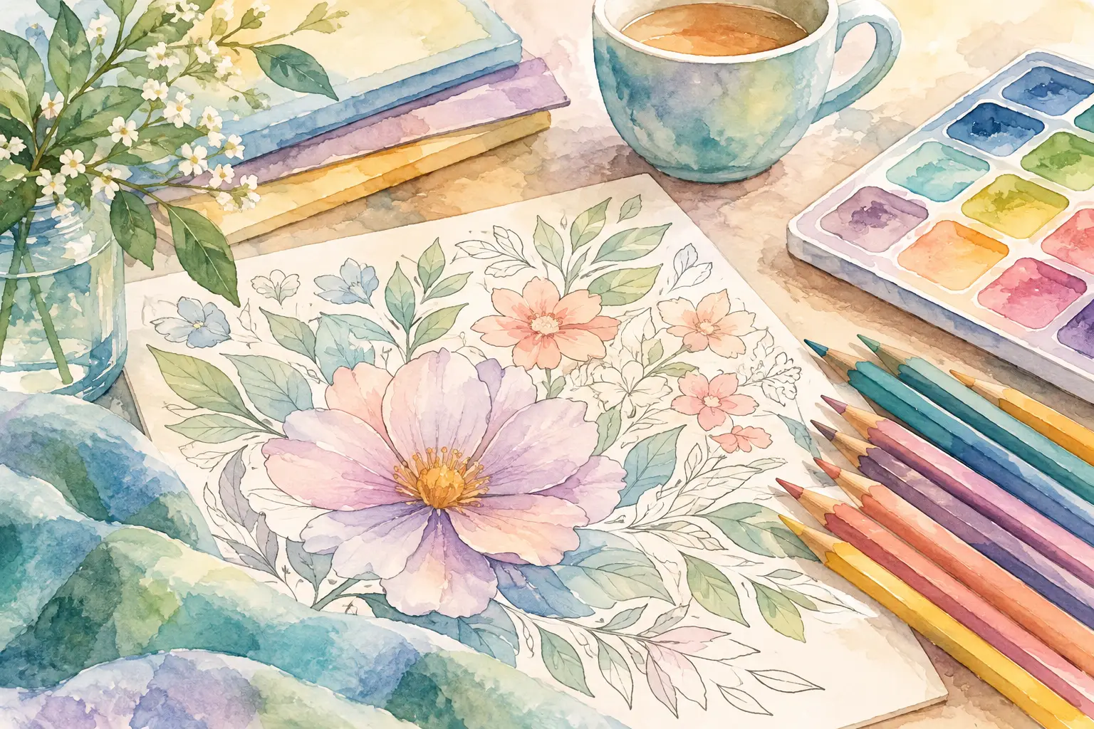
A soft floral palette might include blush, lavender, sage, cream, and warm brown. A quiet forest palette could use moss, olive, gray, taupe, and muted blue. For something warm and cozy, choose peach, clay, faded gold, cream, and cocoa brown.
You can return to these combinations whenever you need an easy creative reset. Over time, you may notice that certain shades become familiar companions. That is part of the comfort of a regular coloring practice.
Make Room for Your Own Preferences
Color guidance is useful, but your own comfort matters more than any palette trend. Some people feel peaceful using cool grays and blue-greens. Others find those colors distant and would rather reach for warm pinks, sunny creams, and gentle oranges. Both approaches can be soothing.
You may also want different colors at different times. A quiet evening might call for a muted, low-contrast page. A difficult afternoon may call for a little more warmth or brightness. Let your color choices meet the mood you are in, rather than trying to create a perfect result.
Whether you are coloring a detailed bouquet or a simple nature scene from an AmBizi book, there is no need to finish quickly or use every pencil you own. Choose a few colors that feel kind to your eyes, let the page unfold slowly, and enjoy the calm that comes from making something one gentle shade at a time.