How to Blend Colored Pencils for Soft Color
A colored-pencil page can begin with the lightest touch: a pale petal, a soft green leaf, a little shadow beneath a sleeping fox. Learning how to blend colored pencils helps those separate marks settle into one another, creating color that feels smooth, warm, and quietly satisfying. You do not need to press hard or aim for perfection. A few gentle layers can be enough to slow the mind and make a simple coloring session feel more complete.
How to Blend Colored Pencils Without Rushing
Blending is the process of softening the boundary between two or more colors. Instead of seeing a clear line where yellow ends and orange begins, your eye sees a gradual shift. It gives flowers more depth, skies a gentle glow, and animal fur a softer, more natural look.
The easiest way to begin is with a light hand. Hold your pencil a little farther from the tip than you might when outlining. Use small, even strokes and let the color build slowly. If you start with heavy pressure, the tooth of the paper – its tiny textured surface – fills quickly. Once it is full, it becomes harder to add or blend more color.
Think of each layer as a quiet pass rather than a final decision. You can always deepen a shade later. It is much harder to make a dark, heavily pressed area feel light again.
Start with colors that sit close together
For a first blend, choose neighboring colors: light blue and medium blue, pale pink and rose, yellow and orange, or light green and leaf green. Similar colors meet easily, so they are especially forgiving on a relaxing coloring page.
Lay down the lighter color first, covering the area with a soft, even base. Then add the darker color from the edge where you want the shadow or richer tone. As you approach the lighter area, reduce pressure. Bring the light pencil back over the meeting point using small circles or short back-and-forth strokes.
That return pass is where the transition begins to soften. Repeat it gently until the colors look settled together. You may need only two or three layers. More layers can create a richer look, but they are not required for a beautiful page.
Use tiny circles for an even finish
Circular strokes are one of the simplest ways to avoid visible pencil lines. Make small overlapping circles, almost like you are polishing the paper. Keep them light at first, then add another layer in the same direction or at a slight angle.
This technique works especially well for flower petals, round fruit, soft clouds, and the curved faces of animals. If your hand gets tense, pause. Blending is more pleasant when your grip is easy and your movements stay small. A relaxed pace often produces smoother color than trying to finish a section quickly.
Build Color in Layers
Colored pencils reward patience, but that does not mean a page needs to take hours. A short, focused session can still create lovely depth when you work from light to dark.
Start with the palest shade in your chosen family. For a pink flower, that may be blush or peach. Cover the whole petal lightly, leaving the very brightest area almost untouched if you want a sense of light. Add a slightly darker pink near the petal base, where the flower naturally folds inward. Then use the pale pencil again to soften the middle.
For deeper contrast, add a darker shade only in the smallest shadowed areas. Burgundy, plum, dark brown, or deep green can add definition, but a little goes a long way. The dark pencil is there to suggest depth, not to take over the page.
Let white work as a softening tool
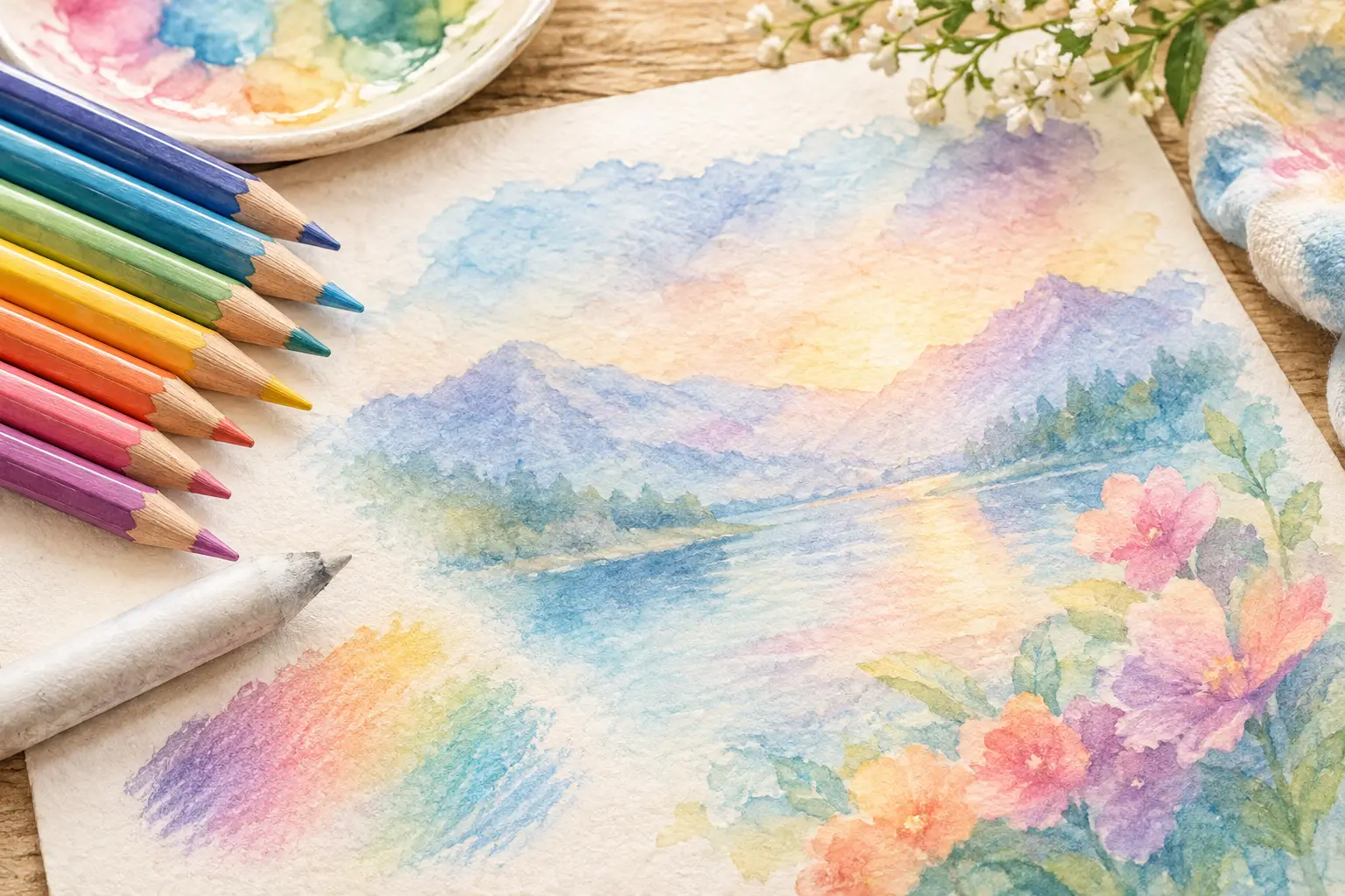
A white colored pencil can gently blend colors already on the page. After applying two or three shades, use white with light-to-medium pressure over the transition. It can soften pencil marks and create a velvety, pastel-like finish.
White works best when you want a lighter result. It may slightly mute bright colors, which can be lovely for delicate blooms, misty landscapes, or a calm nighttime scene. If you want to keep colors vivid, use the lightest color in your palette instead of white to blend the middle area.
A colorless blender pencil is another option. It is made from a clear, waxy or oil-based material that moves the existing pigment without adding white. It can make colors look more saturated and polished. The trade-off is that it can fill the paper surface quickly, so save it for the final layers rather than using it at the beginning.
Blend from both directions
When two colors meet, avoid pushing only the dark shade into the light one. Work in both directions. Bring the darker pencil slightly into the lighter area, then bring the lighter pencil back over the dark edge. This creates a more natural bridge between them.
Imagine a blue-green leaf. Begin with light green, then place blue-green or dark green near the stem and in the folds. Use your light green to move softly into that darker area. If the transition still looks abrupt, add a middle shade such as yellow-green. Sometimes the missing piece is not more pressure, but a color that sits between the two shades.
Try Simple Blending Tools
Pencils alone are enough for most coloring-book pages. Still, a few simple tools can change the finish when you feel like experimenting. Test them in a small corner of the page or on a spare sheet first, especially if your book paper is lightweight.
A colorless blender pencil is the most controlled option. It is tidy, easy to use, and ideal for small details. White pencil is gentler and gives a soft, hazy result. A paper blending stump can smooth dry pigment, though it tends to work better with pencils that release plenty of color. Use a clean stump, because leftover pigment can muddy pale areas.
Solvent can create very smooth, paint-like color, but it is not always the best choice for a coloring book. It may wrinkle thin paper, bleed through a page, or soften printed lines. If you choose to try it, use only a tiny amount on a cotton swab or small brush, and test it separately first. For a calm, low-pressure activity, layered pencil often gives you more control and less cleanup.
Choose Pressure Before You Choose More Color
Many blending problems come down to pressure. If the page looks scratchy, you may be pressing too lightly without enough layers. If it looks shiny or waxy before the colors have blended, you may be pressing too hard too soon.
Try this rhythm: light pressure for the first two layers, medium pressure to deepen the overlap, then light-to-medium pressure with your palest shade or blender for the finish. There is no single correct amount. Pencil brands, paper texture, and even the sharpness of the pencil tip can change the result.
A sharp tip is helpful for edges, veins in leaves, and small printed details. A slightly dulled tip is often better for broad, smooth areas because it lays down color more evenly. You do not need specialized supplies to notice the difference. Simply color a small swatch with a freshly sharpened pencil, then another with a pencil that has been used for a few minutes.
Keep Colors Clear Instead of Muddy
Soft blends do not have to become dull. Muddy color usually appears when too many unrelated shades are layered together, especially complements such as red and green or purple and yellow. Those combinations can be beautiful in very small amounts, but they easily turn brown or gray when heavily blended.
For a cleaner result, stay within a small color family for each object. A sunflower might use cream, yellow, golden yellow, and warm brown. A leafy border might use pale green, medium green, and a touch of cool blue-green in the shadows. This limited approach also makes a page feel more peaceful because the colors belong together.
If an area does become darker than you hoped, lightly layer a pale version of the main color over it. A white pencil may brighten it somewhat, though it will not erase the pigment. Rather than fighting every imperfect spot, let a few deeper areas remain. Natural scenes are full of variation, and your page can be, too.
Practice on Small Areas First
You do not need a separate practice sheet to improve. A single leaf, petal, feather, or small section of sky can be your place to experiment. Choose one area and try two colors with light layers. Notice what happens when you overlap them. Notice how the page changes when you add white, use circular strokes, or leave a tiny highlight untouched.
Coloring is allowed to be simple. You can blend every section carefully, or you can blend only the focal areas and leave the rest with visible pencil texture. Both choices can feel beautiful. The goal is not to make every page look like someone else’s work. It is to create a few quiet minutes that belong to you.
The next time you open a floral or nature-inspired page, begin with one gentle blend instead of planning the whole design. Let one color drift into another, add a little depth where it feels right, and allow the rest to unfold at an unhurried pace.